-
Aeris
Design enterprise fleet management dashboards
-
Timeline
May 2019 — August 2019
-
Context
Aeris was a company that helped bring analytics to vehicle fleet managers. From tractors tot taxis, we provided the hardware and software solutions for keeping track of your vehicle’s performance analytics.
-
Role
Originally I joined Aeris as a front end engineer intern, but I dived deeper into the product design side upon seeing the design gaps we had in the product.
In the summer of 2019, I worked as a software development intern at Aeris communications in Chicago.
Although going into the summer my main task was to pick up the React framework and help with front-end development, this soon shifted upon seeing what Aeris’s AerTrak platform dashboard looked like.
Now, before I do the critique, I should explain what AerTrak does. It is a platform in the Internet of Things (IoT) space, usually meant for fleet managers. Think of a Taxi company that has a lot of vehicles they need to track. These fleet managers will need to know information on emergency alerts, driver performance, and other Key Performance Indicators (KPIs).
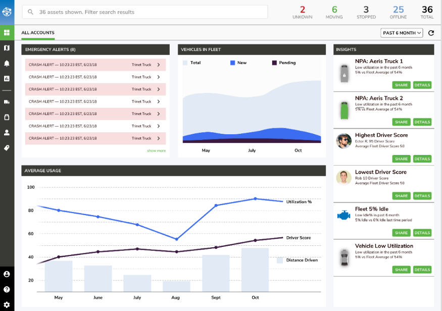
Below, you can see the original AerTrak dashboard:

OG Aeris Dashboard
So upon seeing this dashboard, I asked our UI/UX team whether or not they were working on a redesign. They responded with this screenshot:
The redesign the team was working on when I got to Aeris
Suffice to say, after seeing these designs I decided it would be a good use of my time that summer to hunker down and redesign the dashboard.
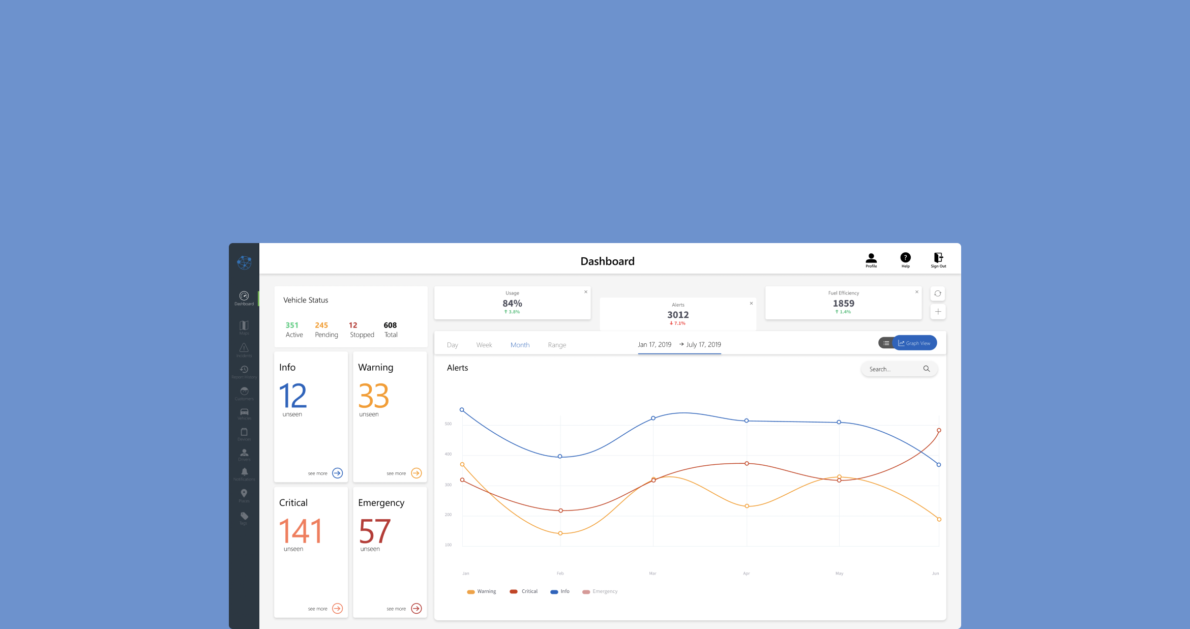
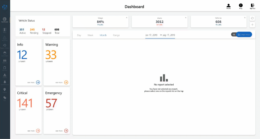
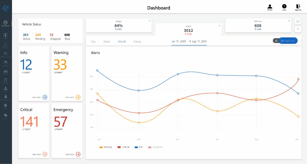
Intuitive Data Visuals
With the main panel of the redesign, you can hop back and forth between not just the reports and their graphs, but also the granular data as well.
By providing a graph view and a data view, users will be able to quickly digest their data, and dig deep when they need to.
Customized Reports
Every fleet manager has different priorities — maybe manager A wants to see the usage reports but manager B wants to see the accident reports.
Since we serviced a wide variety of users, I thought it made the most sense to allow users to fully customize what data they want to see.
Linking Operations & Analytics
Lastly, I wanted to create a link between the operational and analytical data. Through my research, I found that our fleet managers had two use cases for data — operational data where there needs to be an immediate response, and analytical data in order to track trends over time.
Here, I have the operational data on the left-hand side of the dashboard so that managers can at a glance see if there are any immediate issues they need to address.
Upon clicking on the relevant panel, you see the right-hand side of the dashboard update to show the analytical data associated with the operational data you just selected.
